Sole Care
Logo and Packaging design
solo project
time frame: 4 weeks
Visual Designer/Illustrator
Sole Care creates hair and body care formulas that are uniquely tailored to each customer, using all-natural and organic ingredients. Through a process that blends art and science, they craft a personalized self care experience that leaves you feeling clean and calm. They believe that our choices impact the world, and are committed to using only recyclable packaging.
goal: create a logo and branding guide using the companies core competencies.
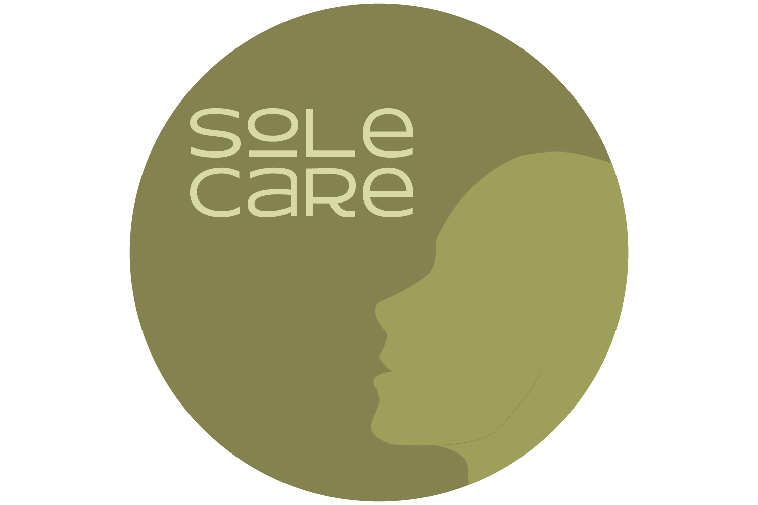
solution: The design process for the Sole Care logo focused on showcasing the brand's commitment to sustainability and individual qualities. The color green was chosen to represent the connection to the earth and the brand's dedication to eco-friendliness.
The logo itself features a side profile of a head without any distinct features or hair, emphasizing the brand's belief that it is the customer that makes Sole Care unique. By leaving out any defining features, the logo is open to interpretation and encourages the customer to project themselves onto the brand.
When the Sole Care logo is placed on the packaging, the blank head profile that was originally featured is now given long hair that flows around the packaging. The hair on the packaging is filled with the main ingredients that make up the customer's unique formula, further emphasizing the brand's commitment to natural and environmentally friendly ingredients while also showcasing the personalized nature of the product.
This design element is intended to add a sense of movement and to the packaging while also conveying a sense of individuality and uniqueness for each customer. And to give it that extra special, personalized touch the packaging is printed in the customers preferred color with their name prominently displayed on the side.


